Victory Sports Center — UI/UX case study.
Brand and interface design for a multi-sport athletic facility — one identity covering basketball, volleyball, racket sports and training.
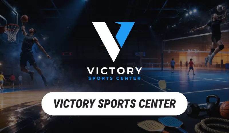
- Client
- Victory Sports Center
- Role
- Brand and web design
- Sector
- Sports & fitness — facility
- Surface
- Brand identity and website
Context
Victory Sports Center is a single venue running many sports at once. The brand has to hold basketball, volleyball, racket sports and training under one mark without belonging to any one of them.
A facility site also has a job most brand projects do not: it is an operational tool. People arrive to check a schedule, book a court or find out whether their child’s session is on.
What the design had to do
One mark, many sports
The identity has to work across disciplines that all have strong visual conventions of their own.
Answer operational questions fast
Schedules, availability and location beat brand storytelling for most visits.
Hold up in the building
Signage, court markings and print use the same system as the site.
Replace this with the brief in Victory Sports Center’s own words, plus the one constraint that shaped the most decisions — timeline, tech, compliance, an existing design system, or a stakeholder. This is the part a hiring manager reads first.
Process
A facility brand lives mostly on walls and phones rather than in a guidelines PDF. The steps below were shaped by where the identity actually gets used.
Understand
Inventory every sport and every surface the identity has to appear on, from a phone screen to a wall.
Research
Look at how members actually use a facility site — schedules and bookings, usually in a hurry, usually on a phone.
Wireframe
Put schedule and booking access above brand content in the page structure, not below it.
Visual design
A bold, sport-neutral mark that survives being printed large, embroidered small, and reversed on court.
Prototype
Check the mark at real sizes and in the real environment rather than only on a presentation slide.
Handoff & support
A usage kit for a team without designers — signage, kit, and social templates.
The steps above describe what each stage had to solve on Victory Sports Center. What turns that into a case study is the evidence — add, for any two or three of them:
- Who you spoke to, and the one finding that changed the design
- A decision you made, and the option you rejected
- Something that tested badly, and what you did about it
- A wireframe or screen — before and after beats a finished shot
Outcome
Facility brands prove themselves through utility and recognition, not through impressions.
Court and session bookings made online
Schedule page usage as a share of all visits
Enquiries answered by the site rather than by phone
Consistency of the identity across signage and digital
Put real figures against the four above, or strike the ones you can’t evidence. If Victory Sports Center never shared numbers, a single sentence from the client about what changed is still worth more than a blank. Right now no project on the site states an outcome, and that is the biggest gap in the portfolio.
Working on something like this?
Available for full-time and contract work across fintech, healthcare and SaaS.